This shows the heating demand reducing as the winter turns to spring. I've made a few improvements over the last few years - insulating the main flat roof; insulating the mansard roof; fitting good quality curtains and closing them at dusk; and the latest improvement was fitting the timed thermostatic radiator valve mentioned in the earlier blog.

This shows that the electricity demand remains fairly constant over the period (except for a few long weekends away). The dappled effect over night is the A++ fridge operating every so often. Our peak use is for washing that is normally done once a week on the weekend.
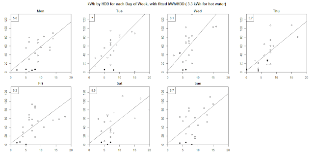
This shows the classic scatter plot of heat used (kWh) vs demand (Heating Degree Days). For a commercial property these can be very accurate, but for a domestic property life is much more variable with evenings out and holidays etc. By removing the holidays (black dots) I've got reasonable results, with higher heating on Wednesdays as that is my wife's day off.
These were done using the R-Project which is a useful tool for easily doing complex charts and statistical analysis. I'll convert it into JavaScript (Flot bubbles) for the OpenEnergyMonitor emoncms project.

No comments:
Post a Comment